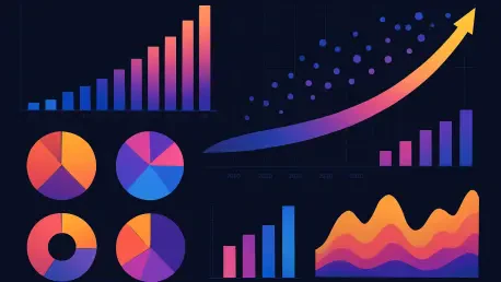
In an era where data shapes decisions across industries, the art and science of data visualization have become indispensable tools for transforming raw numbers into meaningful insights. Imagine a world where complex datasets are no longer daunting spreadsheets but vivid, interactive stories that guide strategic choices in finance, healthcare, and beyond. This transformation owes much to the pioneering work of Jacques Bertin, whose visual variables laid the groundwork for how information is presented visually. Today, with artificial intelligence and immersive technologies driving innovation, the field stands at a remarkable crossroads. The journey from foundational principles to cutting-edge applications reveals a discipline that continuously adapts to meet the demands of an increasingly data-driven society, balancing clarity with engagement to ensure that every viewer can grasp critical patterns and relationships.
Foundations of Visual Communication
Bertin’s Enduring Legacy
The roots of modern data visualization trace back to Jacques Bertin’s seminal 1967 work, which introduced a framework of visual variables such as position, size, shape, color, value, orientation, and texture. These elements serve as the building blocks for encoding data, enabling charts, graphs, and maps to convey both quantitative and qualitative information effectively. Position and size often stand out for their precision in depicting numerical values, making them ideal for detailed comparisons. Meanwhile, color and shape excel at distinguishing categories, helping viewers quickly identify differences. Despite decades of technological progress, these principles remain a cornerstone, ensuring that visualizations cut through complexity to deliver clear messages. Their thoughtful application allows patterns to emerge naturally, fostering understanding across diverse audiences and contexts, from boardrooms to research labs.
A deeper look into Bertin’s framework reveals its adaptability even in a rapidly changing landscape. The emphasis on matching each visual variable to the appropriate data type—using size for emphasis or orientation for directional cues—continues to guide designers in avoiding perceptual errors. This disciplined approach ensures that the human eye can process information without strain, a principle that holds true whether the medium is a static print chart or a dynamic digital dashboard. As industries grapple with ever-growing datasets, the need to adhere to these fundamental rules becomes even more critical. Missteps, such as overloading a visual with clashing colors, can obscure insights and lead to misinterpretation. Thus, Bertin’s legacy acts as a timeless reminder that simplicity and intentionality are key to effective communication through data.
Principles for Effective Encoding
Beyond the basics, the application of visual variables demands a nuanced understanding of human perception. Experts advocate for restraint, suggesting that position should anchor precision while color should be used sparingly to highlight distinctions rather than overwhelm. Testing designs for clarity across different viewer groups ensures that the intended message isn’t lost in translation. This practice is especially vital in high-stakes fields like healthcare, where a misinterpreted chart could influence critical decisions. By aligning visual elements with data characteristics, professionals can craft representations that resonate instantly, turning abstract figures into actionable knowledge without unnecessary complexity.
Another facet of effective encoding lies in recognizing the limitations of certain variables under specific conditions. For instance, texture might enhance depth in a 3D model but could confuse in a 2D graph if overused. Similarly, value—representing lightness or darkness—can subtly indicate hierarchy but risks being misread if not contrasted properly. The challenge is to balance creativity with functionality, ensuring that each element serves a purpose. As data visualization tools evolve, the core tenet remains: prioritize the viewer’s ability to decode information effortlessly. This balance between aesthetic appeal and practical utility continues to define best practices, reinforcing the enduring relevance of foundational encoding strategies in every new technological wave.
Modern Innovations and Future Directions
AI and Technology Integration
The digital age has ushered in a transformative era for data visualization, with artificial intelligence and machine learning redefining how visual variables are applied. Advanced platforms now analyze datasets to recommend color schemes that enhance accessibility, ensuring that visualizations are inclusive for all users, including those with color vision deficiencies. Real-time dashboards leverage orientation and texture to present dynamic information without overwhelming the viewer, adapting instantly to incoming data streams. These tools streamline the design process, allowing professionals to focus on interpretation rather than manual adjustments. The result is a seamless blend of technology and human insight, where AI acts as a partner in uncovering deeper patterns within complex information landscapes.
Immersive technologies like virtual and augmented reality further expand the possibilities, utilizing spatial position and shape to create three-dimensional data interactions. Such innovations enable users to explore datasets in intuitive ways, fostering engagement that traditional 2D charts often lack. Business intelligence applications, for instance, now incorporate AR overlays that use texture to highlight critical metrics in real-world contexts. This shift toward experiential visualization reflects a broader trend of prioritizing user experience alongside raw data presentation. As AI continues to evolve, its integration with visual variables promises even more personalized and responsive designs, ensuring that information is not just seen but truly felt and understood by diverse audiences.
Emerging Trends and Inclusive Design
Current trends in data visualization point to a future where interactivity and storytelling take center stage, driven by AI-narrated designs that combine visual variables like hue and saturation with natural language processing. These innovations craft story-driven charts that guide users through data narratives, making insights more accessible and compelling. The focus on engagement extends to micro-interactions—subtle shifts in value or orientation that signal updates without disrupting the viewer’s focus. This approach marks a departure from static representations, embracing designs that evolve in real time to meet user needs. The emphasis on dynamic, user-centric visuals underscores a growing consensus that data should inspire action, not just inform.
Equally significant is the push for inclusivity, with a strong emphasis on accessibility in design practices. Color-blind-friendly palettes have become standard, ensuring that visualizations remain effective for all viewers. Immersive designs for business applications also incorporate shape and texture to provide richer data experiences without relying solely on color cues. This commitment to human-centered design reflects an understanding that data visualization must serve everyone, regardless of perceptual differences. Looking ahead from 2025 to 2027, the trajectory suggests even greater advancements in personalization, where AI tailors visual experiences to individual preferences, further bridging gaps in understanding and interaction across varied user bases.
Reflections on a Visual Journey
Looking back, the evolution of data visualization unfolded as a remarkable blend of timeless principles and relentless innovation. Jacques Bertin’s visual variables proved their staying power, guiding countless designs with clarity and purpose. The rise of AI and immersive technologies reshaped how data was experienced, turning passive charts into interactive narratives. Challenges like misinterpretation were met with disciplined simplicity and rigorous testing, ensuring that clarity never faltered. As industries adapted to swelling datasets, the field responded with tools and trends that prioritized both accessibility and engagement, reflecting a deep commitment to effective communication. Moving forward, the focus should center on leveraging these advancements to craft visualizations that not only inform but also connect on a human level. Exploring hybrid approaches that merge AI precision with intuitive design could unlock new ways to inspire decisions, ensuring that data remains a powerful catalyst for progress across every domain.


