
In a world increasingly driven by data, the ability to transform complex information into clear, actionable insights has become a cornerstone of effective decision-making across industries like finance, healthcare, and technology. Imagine a financial dashboard where a sudden red spike instantly alerts executives to a market downturn, or a healthcare chart where subtle green shades highlight patient recovery trends—color, in these scenarios, is far more than decoration; it’s a silent yet powerful communicator. This critical aspect of data visualization often determines whether an audience grasps key patterns or overlooks vital outliers. By delving into the strategic use of color theory, professionals can craft visualizations that not only inform but also engage and inspire action. The journey to mastering this skill reveals how hue, contrast, and cultural context can shape perceptions and drive impactful strategies in an ever-evolving digital landscape.
Unlocking the Power of Color in Data Storytelling
Harnessing Psychological Impact for Engagement
Color in data visualization transcends mere aesthetics, acting as a psychological trigger that can evoke immediate emotional responses and guide viewer attention with precision. A well-chosen palette can make a critical data point, such as a sharp decline in sales, stand out through a bold red hue, prompting swift action from stakeholders. This emotional resonance is rooted in how humans associate specific shades with feelings—blue often conveys trust and stability, making it a frequent choice for corporate dashboards, while yellow can signal caution or urgency. Studies have shown that the brain processes visual cues like color faster than text, meaning a strategically colored chart can communicate urgency or success in milliseconds. For industries reliant on rapid decisions, such as stock trading or emergency response, this speed is invaluable. By aligning color choices with the intended emotional impact, data professionals can craft visualizations that not only present facts but also resonate on a deeper, instinctual level, ensuring the message hits home.
Simplifying Complexity with Strategic Palettes
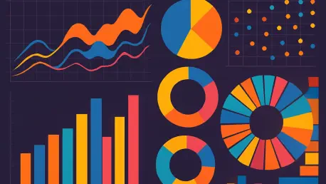
Simplifying intricate datasets through intentional color use is another cornerstone of effective data storytelling, as it prevents cognitive overload and enhances clarity for diverse audiences. Limiting a palette to five or fewer colors, for instance, helps maintain focus on key insights without overwhelming viewers with visual noise. Sequential color schemes, often used in heatmaps, employ gradual shifts in shade to represent data gradients, making trends instantly recognizable. In contrast, diverging palettes highlight comparisons by using opposing hues to distinguish between positive and negative values, such as profit and loss. This approach ensures that even non-expert audiences can interpret complex information at a glance. The key lies in consistency—reusing familiar colors for recurring data types builds trust and reduces the learning curve for regular users. By prioritizing simplicity and coherence, data visualizations become accessible tools that democratize understanding across varied professional fields.
Navigating Challenges and Innovations in Color Application
Ensuring Accessibility for Inclusive Design
Accessibility remains a critical challenge in applying color theory to data visualizations, as overlooking diverse viewer needs can render insights unusable for significant portions of the audience. Approximately 8% of men experience some form of color vision deficiency, which means traditional palettes reliant on red-green contrasts can obscure critical information. Tools like color-blind simulators help designers test and adjust schemes to ensure inclusivity, favoring high-contrast combinations or patterns alongside color to convey meaning. Beyond visual impairments, accessibility also involves considering brightness and saturation for users with low vision, ensuring data remains legible under various conditions. Industry standards increasingly advocate for universal design principles, pushing creators to prioritize palettes that work for everyone. By embedding accessibility into the design process, professionals can guarantee that their visualizations serve a broader audience without sacrificing impact or clarity.
Balancing Cultural Contexts and Ethical Use
Another layer of complexity in color application arises from cultural differences, which can drastically alter how data is perceived and interpreted across global audiences. While red might signal danger or urgency in Western contexts, it often symbolizes prosperity and good fortune in many Asian cultures, potentially shifting the tone of a financial report or marketing dashboard. This variability demands a nuanced approach, requiring designers to research target demographics and adapt palettes accordingly to avoid miscommunication. Ethical considerations also come into play, as manipulative color choices—such as overly alarming hues to push a narrative—can mislead viewers and erode trust. Best practices emphasize transparency and intent, ensuring colors enhance rather than distort the truth. By navigating these cultural and ethical dimensions, data professionals can create visualizations that respect diverse perspectives while maintaining integrity in their messaging.
Embracing AI and Future Trends
The integration of artificial intelligence into color selection for data visualizations marks a significant innovation, though it comes with unique challenges that require careful oversight. AI-driven tools can analyze viewer preferences and adapt palettes in real-time, tailoring dashboards to evoke specific responses or align with branding. However, over-reliance on algorithms risks losing the human nuance essential for context-specific decisions, such as reserving bright shades for critical alerts. Emerging trends also point to a growing emphasis on emotional resonance, with colors like green symbolizing growth in sustainability metrics, amplifying the storytelling power of data. Experts caution that while technology offers efficiency, human judgment must guide final choices to balance functionality with emotional impact. Looking ahead, the evolution of real-time analytics suggests even more personalized color schemes, promising to redefine how data connects with audiences over the coming years.
Reflecting on Transformative Insights
Looking back, the exploration of color theory in data visualization revealed how a seemingly simple element wielded profound influence over decision-making and audience engagement. It became evident that deliberate color choices transformed raw numbers into compelling narratives, guiding industries through critical insights with clarity and speed. The focus on accessibility ensured that no viewer was left behind, while cultural and ethical mindfulness prevented missteps in global communication. Even as AI reshaped the landscape, the necessity of human oversight stood firm, preserving the balance between innovation and intent. For those shaping the future of data storytelling, the next steps involve integrating these lessons—choosing limited, inclusive palettes, respecting diverse contexts, and leveraging technology with caution. By doing so, professionals can continue to illuminate hidden truths in data, crafting visualizations that not only inform but also inspire action across an increasingly connected world.