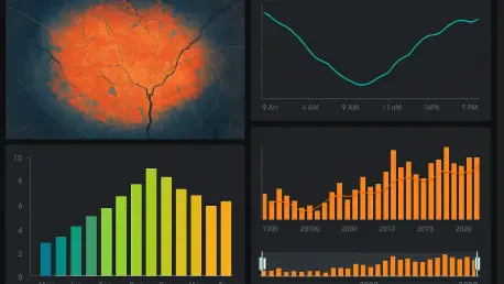
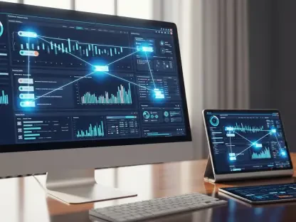
In an era where data drives decision-making across industries, the ability to visualize and analyze temporal information with precision has become a critical asset for professionals ranging from city planners to environmental scientists, and the latest update to ArcGIS Dashboards, a cornerstone tool within the Esri ecosystem, marks a significant leap forward by introducing support for three innovative temporal field types: DateOnly, TimeOnly, and Timestamp Offset. Rolled out as part of the June release this year, these enhancements are designed to address longstanding challenges in handling time-related data, offering users unprecedented flexibility and clarity in their dashboards. Gone are the days of wrestling with cumbersome workarounds or cluttered displays caused by the limitations of a single Date field. Instead, this update empowers users to tailor their data representations to specific needs, whether tracking project milestones, monitoring recurring schedules, or managing global datasets across multiple time zones. This article explores the transformative impact of these new features, delving into how they streamline workflows and elevate data storytelling. From cleaner visualizations to advanced analytical capabilities, the update promises to redefine how temporal data is managed, making dashboards not just tools, but powerful narratives of time-driven insights.
Overcoming Historical Data Display Challenges
The foundation of this update lies in its response to persistent user frustrations with the traditional Date field in ArcGIS Dashboards. For years, this field forced the storage and display of both date and time components, even when only one was relevant to the analysis or visualization. This often resulted in dashboards that appeared cluttered or required intricate formatting solutions to mask unnecessary information, wasting time and risking errors. Moreover, the absence of inherent time zone awareness in the Date field created significant hurdles when handling data spanning multiple regions, often leading to misinterpretations or additional manual adjustments. The introduction of specialized temporal field types directly tackles these issues by allowing data to be captured and presented in a way that mirrors its intended purpose. This shift eliminates the need for convoluted workarounds, ensuring that temporal data is no longer a source of frustration but a seamless part of the analytical process. Users can now focus on deriving insights rather than battling with the platform’s limitations, marking a pivotal improvement in usability across diverse applications.
Another key aspect of overcoming these historical constraints is the newfound precision in data handling. With the old system, representing a simple date like a project deadline often came with an attached irrelevant timestamp, muddying the visual output. Similarly, recurring time patterns, such as daily schedules, were unnecessarily tied to specific dates, complicating trend analysis. The updated field types break this rigid structure, offering a tailored approach where data storage aligns with its real-world context. This not only enhances the aesthetic quality of dashboards by reducing visual noise but also improves the integrity of the data itself. By addressing these deep-rooted pain points, the update ensures that temporal information serves as a clear, reliable foundation for decision-making, whether in local project management or complex, cross-regional operations.
Exploring the Innovative Temporal Field Types
At the heart of this update are three new temporal field types—DateOnly, TimeOnly, and Timestamp Offset—each crafted to address distinct needs in data management. DateOnly is a game-changer for scenarios where only the date matters, such as recording project deadlines or tracking significant events like hospital admission dates. By stripping away irrelevant time components, this field type ensures that visualizations remain focused and uncluttered, delivering information in its most relevant form. Meanwhile, TimeOnly caters to use cases involving recurring time patterns, such as bus schedules or peak traffic hours, allowing analysis of time-of-day trends without the baggage of specific dates. Timestamp Offset, on the other hand, is a critical tool for global data integration, storing date, time, and UTC offset together to provide unambiguous representation of events across time zones. These field types collectively redefine how temporal data is modeled, aligning storage formats with practical applications and reducing complexity for users across industries.
Beyond their individual functionalities, these field types represent a broader shift toward customization in data handling. The ability to choose a field type that matches the inherent structure of the data—whether it’s a standalone date for a milestone or a time-specific pattern for operational analysis—means that users can now craft dashboards with greater accuracy. For instance, Timestamp Offset ensures that multinational organizations can track events without the confusion of mismatched time zones, although current display settings adjust to the dashboard’s configured zone. Workarounds like custom expressions offer additional flexibility to preserve original offsets when needed. This trio of field types not only addresses specific technical gaps but also enhances the overall adaptability of ArcGIS Dashboards, catering to a wide spectrum of professional needs from environmental monitoring to business logistics, and setting a new standard for temporal precision.
Enhancing Visual Clarity and User Experience
One of the most immediate benefits of the new temporal field types is their impact on the visual presentation of data within ArcGIS Dashboards. Consider a hospital dashboard tasked with displaying patient admission and discharge records: using the DateOnly field, the data can now be shown without the distraction of irrelevant timestamps, resulting in a streamlined table that communicates essential information at a glance. This reduction in visual clutter is not merely cosmetic—it allows stakeholders to focus on what truly matters, whether it’s identifying trends in patient flow or planning resource allocation. By eliminating the need for manual formatting to hide unnecessary data, this update saves time and minimizes the risk of errors, ensuring that dashboards serve as clear, effective tools for communication and analysis across various sectors.
Equally significant is how these improvements elevate the overall user experience by simplifying data interaction. TimeOnly fields, for example, enable precise representation of schedules or recurring events in tabular formats, making it easier to analyze patterns like rush hours or service timings without the interference of specific dates. This clarity extends to stakeholders who may not be deeply technical, allowing them to interpret dashboards without needing to navigate through extraneous details. The result is a more intuitive interface where the data speaks for itself, reducing the learning curve for new users while enhancing efficiency for seasoned professionals. From public health officials to urban planners, the enhanced visual output ensures that temporal data is not just accessible but also actionable, fostering better-informed decisions with minimal effort.
Boosting Analytical Depth with Advanced Aggregation
The analytical capabilities of ArcGIS Dashboards have received a substantial upgrade with the ability to aggregate temporal data more effectively using the new field types. Take, for instance, environmental monitoring dashboards that track air quality metrics like PM2.5 levels across multiple sites. By leveraging DateOnly fields as category markers in serial charts, users can summarize daily averages to pinpoint anomalies, such as sudden spikes potentially caused by events like holiday fireworks. This aggregation by date, month, or even year provides a granular view of trends, making it simpler to compare patterns across locations or timeframes. Such functionality transforms raw data into meaningful insights, enabling agencies to identify critical issues and respond with targeted interventions based on historical or seasonal fluctuations.
Further enhancing this analytical power is the flexibility to focus on specific temporal dimensions without unnecessary data noise. With DateOnly fields, long-term trend analysis becomes more accessible, as irrelevant time components no longer obscure the bigger picture. This is particularly valuable in fields like infrastructure planning, where understanding yearly progress or monthly milestones can shape funding decisions or policy adjustments. The ability to distill complex datasets into clear, date-based summaries ensures that dashboards are not just repositories of information but active tools for strategic planning. As a result, users can move beyond surface-level observations to uncover deeper correlations, whether tracking environmental changes or operational efficiencies, ultimately driving more informed and impactful outcomes across diverse domains.
Precision Filtering for Targeted Insights
A standout feature of the TimeOnly field type is its support for advanced filtering based on specific times or time ranges, opening up new avenues for targeted data analysis. Imagine an air quality dashboard used by a school district to assess safety during outdoor activity hours, typically between 9:30 AM and 1:00 PM. By applying TimeOnly filters to indicators and serial charts, distinct patterns emerge—such as weekly cycles in pollutant levels—that might be masked in whole-day averages. This capability allows for a nuanced understanding of temporal data, revealing insights critical to decision-making in real-time contexts. For public health officials or educational administrators, such precision can directly influence policies on outdoor activities or emergency responses, ensuring safety based on accurate, time-specific information.
This filtering functionality also proves invaluable in dynamic, real-time data streaming environments where immediate context is essential. By narrowing the focus to particular hours or time windows, users can isolate relevant trends without wading through irrelevant data points, enhancing the responsiveness of their dashboards. This is especially beneficial in sectors like transportation, where understanding peak congestion times can optimize scheduling or resource deployment. The ability to apply such filters transforms ArcGIS Dashboards into agile tools that adapt to specific analytical needs, rather than presenting a one-size-fits-all view. Consequently, professionals gain the power to drill down into the exact temporal segments that matter most, ensuring that their insights are both timely and relevant to the challenges at hand, from daily operations to long-term planning.
Navigating Global Data with Time Zone Accuracy
For organizations dealing with data across multiple regions, the Timestamp Offset field introduces a vital solution to the complexities of time zone management. Unlike the traditional Date field, which lacked inherent time zone awareness, this new field type stores date, time, and UTC offset together, ensuring that events are recorded with unambiguous temporal context. This is particularly crucial for global operations, such as tracking seismic activity through earthquake datasets, where precise timing across regions can mean the difference between accurate analysis and costly misinterpretation. Although dashboard displays currently adjust to a configured time zone—either the device’s or a manually set one—workarounds like custom Arcade expressions allow users to extract and present original offsets when necessary, maintaining data fidelity in visualizations.
The significance of this feature extends to fostering seamless collaboration among international teams or stakeholders. By providing a consistent framework for temporal data, Timestamp Offset fields mitigate the risk of errors that arise from manual time zone conversions, which were often required in the past. This is especially relevant for industries like logistics or emergency response, where coordinating activities across continents demands absolute clarity on event timings. The ability to handle such data natively within ArcGIS Dashboards reduces administrative overhead and enhances trust in the accuracy of shared information. As global connectivity continues to shape professional landscapes, this update ensures that temporal data remains a unifying factor rather than a barrier, enabling precise, reliable analysis no matter where the data originates or is viewed.
Streamlining Workflows for Diverse Users
Beyond the specific technical advancements, the broader impact of these temporal field updates lies in their ability to streamline workflows for a wide array of users. By aligning data storage with its intended use—whether isolating dates, focusing on specific times, or capturing global timestamps—these enhancements minimize the need for manual adjustments that previously consumed valuable time. Errors stemming from forced formatting or misaligned data representations are significantly reduced, allowing professionals to concentrate on interpretation rather than data wrangling. This is a boon for fields as varied as urban planning, where clear project timelines are essential, to environmental science, where precise temporal trends inform policy. The result is a more efficient dashboard-building process that benefits both novice users and seasoned analysts alike.
Additionally, the user-centric design of these updates ensures that clarity and accessibility are prioritized at every level. Dashboards are no longer just technical outputs but intuitive platforms that cater to diverse audiences, from decision-makers needing quick overviews to specialists seeking detailed insights. For instance, a city manager can now review infrastructure progress with straightforward date-based visuals, while a researcher can apply time-specific filters to uncover subtle patterns in data streams. This versatility means that ArcGIS Dashboards can adapt to varying levels of expertise and application needs, reducing barriers to effective data use. By cutting down on repetitive tasks and enhancing data integrity, these temporal field types empower users to focus on what truly drives impact—turning information into actionable strategies across their respective domains.
Paving the Way for Future Data Narratives
Reflecting on the rollout of these temporal field enhancements in ArcGIS Dashboards, it’s clear that a significant milestone has been achieved in addressing past limitations of temporal data management. The introduction of DateOnly, TimeOnly, and Timestamp Offset fields tackled critical gaps, offering users refined control over how time-related information is stored, visualized, and analyzed. These advancements delivered cleaner dashboards, deeper analytical capabilities, and robust solutions for global data challenges, transforming how professionals across industries approach their work. Even with minor constraints, such as display adjustments for time zones, the provided workarounds and hints at future refinements underscore a commitment to continuous improvement.
Looking ahead, the focus should shift to leveraging these tools for even greater innovation in data storytelling. Users are encouraged to experiment with these field types in their unique contexts, identifying ways to integrate them into existing workflows for maximum impact. Exploring custom expressions or combining temporal filters with other dashboard features could unlock additional layers of insight. As the platform evolves, staying engaged with updates and community practices will ensure that temporal data remains a powerful asset in decision-making. This update has laid a strong foundation, and the next steps involve building on it to craft richer, more dynamic narratives that drive progress in an increasingly data-driven world.


